
Project.two
Task.two
Project.two
Task.two
Project.two
Task.two
Project.two
Task.two
Project.three
Task.five
Project.three
Task.five

Pitch Video
A level 3 VFX students FMP
Pitch Video
A level 3 VFX students FMP
Experimental Research
Audio, video and troops
Audio
soundtrack experimentation and research
Audio will be a pretty large part of the project as it will be a constant throughout the video but has to change based on what I'm talking about, for example battle music will be intense and a good deal louder than say music that would play whilst narration is happening, In my pitch proposal video I gave a few examples of the music I will use most of witch was from videogames and the like.
Here I plan to make some really simple mock ups of what my content will look and sound like, primarily focusing on audio levels and what kind of music will fit each scenario. the scenarios I will be working on will be as follows: introduction, general narration, battle and resolution.

The plan for the music to come in when I first start to talk about the tsunami it will be quite quiet as to not overpower my voice but when I finish there will be a bunch of artwork going across the screen of the tsunami and the destruction it caused at this point the music will ramp up to hopefully have the same kind of effect that the freak weather had on the Mongols, there is a bit in the audio from 0:30 to 0:45 which is the build-up and at 0:50 it unleashes into the full force of the music, this is the reason I think (aside from the name) this is the perfect track for this part in the video.
Balancing complex audio with narration and other sound effects isn't something I've actually done properly before, in pretty much any of my previous projects, sure I added one piece of music, made it quieter for the entire video then put my narration over the top of it without really thinking, timing and transitions didn't matter to me because I had one track and one voiceover.
When it comes to this research I want to experiment on what I can do to really enhance the audio experience for the viewer, as I know from talks with one of my friends in the film and Tv course that audio is one of the most important things when it comes to viewer retention and experience. Viewers may and probably will stop watching because the audio isn't balanced or because the mic you used to record is really bad quality.
these are all things I have to think about
The tsunami
The plan for the music to come in when I first start to talk about the tsunami it will be quite quiet as to not overpower my voice but when I finish there will be a bunch of artwork going across the screen of the tsunami and the destruction it caused, at this point the music will ramp up to hopefully have the same kind of effect that the freak weather had on the Mongols.
There is a bit in the audio from 0:30 to 0:45 which is the build-up and at 0:50 it unleashes into the full force of the music, this is the reason I think (aside from the name) this is the perfect track for this part in the video.
The piece of music I'm looking at is the track 'tsunami' from the 2011 game Total war shogun 2. Straight away just from the name you can probably guess what where in the video I'm going to use this track.
Its excellent battle music incorporating a ton of east Asian instruments much like most of the Shogun 2 soundtrack, The Shakuhachi a Japanese flute features predominantly as well as drums, as lot of drums (Taiko).
The beat and rhythm lend it a distinctly militaristic vibe with the cymbals and gongs crashing in and out make me think of waves crashing into and decimating Mongol ships.


Audio in audacity
To have a test background for the audio i started of with writing a short script on google docs, not my best work but it will serve the purpose for the test.
I went about recoding this in audacity with is a free audio editing program I've used a bunch of times before my audio set up is a blue yeti mic with 2 pop filter over it to dampen my Plosives (p's and s's), basically to not peak the mic from the air hitting it, this is combined with a rode boom mic arm and a shock mount .
I've used this setup for the entire time I've been on the course and I'm defiantly happy with the quality of sound it produces.


Straight out the gate there is lots of audio editing we can do I cleaned up the takes and made it into one relatively seamless audio track
After that the large bit of silence at the end will come into play, there is a feature called noise reduction that eliminated background noise from a sample you take, In my case this would be the noise of my PCs fans.
Unfortunately I automatically applied this to the audio and couldn't get the unedited version to compare.
This here is how I applied the noise reduction filter, I got the sample and then simply pressed ctrl + A to select all of the audio and then selected the filter.
The filter can leave the voice sounding tinny and kind of hollow that's why I will add a number of other filters to it to make the audio sound quite a bit more pleasing.
I followed the guide in this video that I've been using for a few projects now I've changed it some of the values but the concept is the same.
I figured I would go into more detail about my audio process in the production diary, and that it would needlessly prolong this part of the experimental research.
The First thing I did was open up premier pro and import all my audio, the voice over and the track from shogun 2, I lined them up and straight away started messing with the audio levels in the effects panel, you can also do that on the timeline if you extend the height of the audio channels but only with the level this makes it quicker to do but a lot less intuitive for fine tuning.
What I ended up with was a pretty okay transition in my opinion from the first track of music that I added because the build-up of the second was too loud and distracting in my opinion, to the height of the action in the second track.
everything else I did was explained in the video below:
Audio in Audition
A couple weeks after I finished this experimentation I remembered the fact that I had access to the professional audio editing software Adobe Audition, it works almost the exact same way as audacity but with many more features and a lot of potions for fine tuning audio, unlike premier witch works but rather use software that gives me a much greater control over the quality of work I output. as It stands I don't have time to redo the research in Audition but all my production work involving audio will be ran through there.
Troop blocks
Arms And Armor
With my troop blocks I plan to draw inspiration from a few youtubers that make the content I wish to emulate. I also plan to make some test original designs myself. I'll create almost all my designs in Adobe illustrator and animate them in Adobe after effects.
Types of troop blocks
Regular

Character


The First type of block I want to talk about is the regular or troop block, I will use examples of a design from the kings and generals video 'Real Ghost of Tsushima - Mongol Invasion of Japan DOCUMENTARY' to show the kind of thing I want to create.
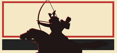
The troop blocks will be representative of the regular Yuan soldiery, the Mongol horse archers as well as mounted and unmounted samurai. I know the pictures are very low resolution but I could only get screen captures directly from YouTube. these are just hear to give an example.
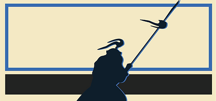
The second type is the character block, this won't come up nearly as much as the regular troop version but will still come up in say the battle at Komoda beach when I want to show So Sukekuni or Saito Sukesada, this however means I need to find images of them, at least in the latter's case I can use a picture that is suppose to be them but anyone for anyone else like the Mongol general Ho Chang (?) I may have to create or use stand-in artwork, much like Kings and generals did.
The plan right now is to make a few different examples of each just the regular type as the character is the same just with a picture in a frame instead of the silhouette, starting with one inspired by kings and generals.
Arms and Armour
Before I start to create this design I need to look at the Armor and weapons of the combatants as its the main thing on the block, the Mongol invasion book by Stephan Turnbull once again has me covered with pages 29 through 32 dedicated to the equipment carried onto the battlefield.
I've looked into the Armor quite extensively so I'll present a short description of the one I'm going to be using with some accompanying pictures. to give you an idea of what it will look like on the troop block.
Japanese Ō-yoroi and weapons

The Ō-yoroi or 'great armor' was one of the earliest types of Armor we can readily associate with the samurai, It's boxy build and large sholdergards or 'sode' make it a distinctive set that almost anyone not versed in history could name as samurai equipment.
Its distinctive silhouette will make it an easy task to translate it into a outline I can use in my troop blocks, the large head ornamentation was really only for high ranking samurai or lords but I figured I'd put it in all of the troop blocks as it really sells the samurai look.
The weapons of the samurai were primarily at this point the bow 'Yumi', this is why there Armor was designed to accommodate horseback archery, see the lack of plaiting under the arms, it gave them a greater freedom of movement, witch obviously helped in combat.
They didn't only carry bows however many were armed with short swords 'tachi' and pole arms 'naginata', I plan to show this with two types of troop block, one mounted with a bow and the other on foot with a naginata.


This is one of the images I plan to base my silhouette of the mounted samurai on, I may have to move some elements about such as the horses head as when in black I'm not sure it will be 100% clear, other things like making the crest bigger and more pronounced may be done just to make it look more appealing.
For the experimental research I will be making one samurai and one Mongol inspired block. this is so I can do a test animation with the map I made in the next section.
Creating the Silhouette
As you can see I changed the picture to one from the Takezaki Suenaga scrolls, I thought this looked better as it had a lot more definition of the bow, thus making it easier to recognise.
to start I imported the whole image into Illustrator and lowered the opacity of the layer this was just so I could judge the shape of the silhouette better.
To start marking out the outline of the samurai I used the pen tool much like what I'll do when making the maps later on, I use curved lines to minimize the 'edginess' of the vector shape that can occur if you just use straight lines.
I constantly change colour modes in the stroke settings on the left to check what the whole image would look like when filled, This helps me make sure I'm happy with my designs.
I started recording after I did the bow and the arm so I'll explain some of that here, the bow was probably the hardest bit to get right when making the outline, as it has to be a seamless line at least on the top half as the bottom is covered by the hoarse, however I simply made a path consisting of just two points making It a line, I then made the stroke about 5 pixels wide to bulk it out, after that the arm and the arrow were easy enough to trace out.
Later on in the video I use the path tool or white arrow tool to adjust a path node by the horses head, luckily I didn't have to use this almost at all whilst creating the outline, When I finished I grouped all the paths together (bow, arrow, arm and everything else), to make them easy to move and manipulate.
In the next video I decide that as talked about earlier the lack of a large crest on the helmet makes the whole design a lot less recognisable and decide to add one, as you can see I use one of the sets of Armor I've already mentioned and I think it fits the look perfectly, again I lined it up on a separate layer and used the pen tool to go around the outside.
As the perspectives were obviously different between the two images I was required to improvise a centre to the crest witch was easily accomplished with a small circle, after that I was pretty happy with the end result, I finished the samurai by selecting all the paths and shapes and grouping them with the unite pathfinder tool (first one top left)
This basically made all the paths one object, its an easy way to combined lots of shapes for ease of movement and animation.

Creating the blocks
In this video I start to experiment with shading/highlighting the samurai as well as making the actual blocks to put them on, the blocks were defiantly the easiest to do simply make a few squares and put them together to look like the ones from kings and generals, I closely followed the colour pallet in terms of the red and tan colours as I thought it would look good with the map I've created.
In between the two videos I made a number of adjustments, from removing the sword at the back because I thought It looked dumb to changing the position of the samurai in relation the the block as there was too much of the horse and not enough of the warrior showing, as well as removing the highlight from the back so it was only on one side giving it an edge highlight, I thought that, whilst not being the same as the KAG example because of the pose of the picture, it fits my purpose quite well.
The pathfinder elements were something I had previous knowledge on from all the way back at the start of the course I remember doing a one hour lesson in making stuff in illustrator turns out it actually helped a lot as I don't think I would of found out about this otherwise.
Its explained in the video but what happens is I use the divide function when targeting both the large rectangles and the image of the horseman, this makes every part of the images that are crossing to be essentially separated from the main silhouette, thus allowing me to delete them, leaving me with a clean rectangle ready to be exported and animated.


When I was done I decided to make a few variations of the base one (Left), My favourite by far was the middle one or coloured one I think making it a a deeper shade of red was a great idea because it makes it stand off from the background as well as making the red edge highlight pop just that bit more. as for the one on the right, the group one, this was more of just a pure experiment personally though I'm pretty happy with it, I removed the red highlight from all but the one at the fore and changed the colour of grey to a slightly darker one the further you got back, this along with lowering the opacity by 5% increments made it look more like a layered group, I also decided to remove the dark grey line behind them because it made the block way too busy in my opinion.
The images below are the two final blocks I plan to use in the experimental animation I have also made a quick arrow to signify the samurai firing into the Mongols and vice versa. one thing I didn't check was if the images look alright when flipped, this would be done to ensure it looks okay from both sides as the image may look incredibly slanted to one side, witch the Mongol does. This is just something that I can add to the list to watch out for when it comes to the actual creation of the troop blocks.
But for now this is what my impressions of KAGS troop block look like, I do plan to make my own design but this will work great for testing the kind of animation I plan to do.
Map designs
making my own
I decided the first map I would try to make would be Japan as it will be the focus point for most of the project, I started by finding a suitable map to copy from. At first though I tried to find a world map that included enough detail and was 1080p as without the correct resolution I wouldn't be able to size it as accurately as I wanted, after a good while of searching I gave up on fining a world map and moved on to looking for one of just Asia, as I figured that it would have a higher degree of detail, I had even less luck with this and decided that I would have to make one with just Japan, and superimpose a map over it to make sure the distance between it and the mainland is correct.

When making the map in illustrator I used two techniques when marking the edges with the pen tool, one is more steady and precise, using the curving feature and sticking to the outline. an example of this is shown above. I decided to use this on the smaller islands as I'd have less to do and it would be a lot easier to pick up on details if it was wrong, overall I'm pretty happy how it came out and I can defiantly recognise it as Shikoku.
The other way of doing it is much quicker but less precise however it is a good way to outline the larger two islands, I basically don't use the curving tools or if I do its in a relatively imprecise manner, I quickly go around the outline not paying to much mind to small mistakes but still keeping the shape correct, this in my opinion is the best way to outline as its just easier and takes considerably less time with about the same level of quality.
A example of this is shown below.
[NOTE] After some experimentation I've decided I will only use the second method If I don't plan to zoom into the map at all, as doing this makes the flaws a lot more visible. Honestly I should of seen that coming but I'm happy I realised whilst experimenting.

Short evaluation
As you can see in the video to the left I had some trouble when it came to Lake Biwa in the middle of Japan, as when I made the fill non transparent it covered it up, I fixed it as shown below by simply making a new layer moving it above the main layer and creating a cut out for just the lake.
There could be some issues with the middle staying white when imported into other software but this is an easy fix with a colour key effect, I will however find a better way to do this when creating the final maps.
[update]
One way I've thought of doing this is after exporting and writing everything up I remembered that I can Just simply add another cut-out on the same layer, letting it be transparent witch will save me the work later.
All in all I've tried to keep the design relatively simple as I want to leave myself to develop it more when I actually go to make the maps, this was supposed to be an exercise to test how hard it will be to make this kind of thing, I'm planning on adding animated elements to it as well as variations of colours and shadow effects like those shown in the video I referenced.
I'm exited to test ways to further enhance my maps latter on in the production process, but so far I'd say this is a great start.

The final Map
